


Forgotten Aspect Album Art
CD packaging is the mother of brand identity

Well, in any case, I wanted to make sure that this first album release under the Alt Jazz Ark umbrella featured a decent brand identity.
The Alt Jazz Ark logo has been a sketch since pre-pandemic. The logo I use on my mailing list is a picture of a drawing in splotchy ball point pen on rough card stock.
It was the best I could do at the time. Well, I still did the best I could, which at the present time included some time with Illustrator.
With the logo in hand, I adopted the font and color from the altjazz.org website to get the CD design
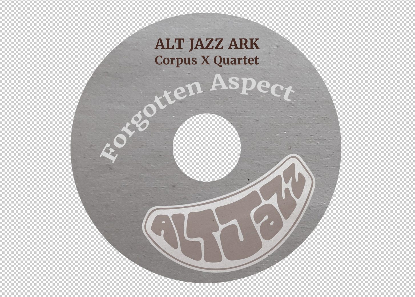
It is intended to be the words “Alt Jazz” in the shape of an ark.
Like the logo design and the graphic design, the photo on the back cover is also an exercise in doing perhaps too many things oneself, instead of hiring a professional.

After going through so much project history in my post Towards Liner Notes, I ended up distilling it to a single CD insert side.

And finally the other side of the insert has the instrumentation and track list.

Coming to a gig near you, in the soonish time frame.